You have not yet added any article to your bookmarks!
Join 10k+ people to get notified about new posts, news and tips.
Do not worry we don't spam!

Post by : Anis Farhan
Google’s upcoming Android 17 — the next major version of its smartphone operating system — may be taking design cues from one of the most debated visual changes in Apple’s recent software history: the semi-transparent, blur-heavy interface style introduced in iOS 26. According to early internal builds seen by industry watchers, Android 17 could feature menus and system UI elements with blurred, see-through backgrounds, a trend Android users have previously mocked on iPhones.
This move represents a notable shift in Android’s design language, potentially blurring the lines between the visual identities of the two dominant mobile platforms. It raises questions about whether copying this style enhances Android’s aesthetic appeal or simply brings over a flaw that many users find distracting or detrimental to readability.
According to reports based on leaked internal Android 17 builds:
Menus Could Get Blur: Traditional solid backgrounds in certain menus like the power menu, volume control panel, and other system UI components may be replaced with semi-transparent, blurred backdrops that reveal wallpaper or other content behind them.
Influenced by Dynamic Color: The blur effect might be tied to users’ current theme choices, with Google’s Dynamic Color system influencing how opaque or tinted these translucent layers appear.
Homescreen Aesthetic: On the homescreen, blurred UI elements could create a new visual continuity with the background and app icons, aligning Android’s look more closely with trends seen in other systems.
While this change is expected to be less dramatic than Apple’s Liquid Glass shift from iOS 18 to iOS 26, it nonetheless signals that Google is exploring more expressive design elements beyond the flatter, more minimal aesthetic that has dominated Android in recent versions.
Android and iOS have traditionally maintained distinct design philosophies. Android’s Material Design language, developed by Google over the past decade, has focused on clarity, depth, and intuitive motion, while Apple’s recent Liquid Glass style emphasizes translucency, layered light, and visual flair.
If Android 17 incorporates more blur effects:
Design Convergence: It reflects a trend toward multiplatform visual influences, where design innovations on one ecosystem inspire others — sometimes for better, sometimes for worse.
User Expectations: Android users who value crisp, functional interfaces may find the move curious, especially if it appears to emulate a UI change that is often criticised for reducing contrast and legibility.
Aesthetic vs. Functionality: The shift underscores a wider debate in software design about the balance between stylistic experimentation and the core requirement that UIs remain functional and legible in everyday use.
Design language convergence between platforms has happened before — for example, when Android introduced gesture navigation following Apple’s lead — but visual blur effects tend to be far more subjective in how they affect usability.
Apple’s Liquid Glass UI in iOS 26 brought blurred and glass-like effects to many interface elements, and it hasn’t been universally welcomed. Some users and critics argue that:
Legibility Suffers: The added transparency can make text and icons harder to read against shifting backgrounds.
Visual Overload: The layered blur can draw attention to the interface itself rather than the content users want to see.
Mixed Reactions: While some appreciate the new aesthetic, others describe it as unnecessary flair that feels more about style than improved usability.
Community reactions on social platforms have reflected a split: some find it “fun and cool,” while others lament that it feels like a step backward in clarity and purpose.
Apple even introduced settings toggles in later iOS 26 updates to give users more control over how the blur effects appear — a tacit acknowledgment that not all users embraced the change.
Translating iOS-style blur into Android is not a simple copy-paste; it reflects how design attitudes evolve across ecosystems. There are several potential scenarios:
Refined Blur Usage: Google may use blurred backgrounds selectively, ensuring that readability and performance are not compromised.
Dynamic Contrast Adjustments: By tying blur levels to dynamic themes, Android 17 might address contrast and visibility issues better than critics felt iOS 26 did.
User Customization Options: If Google allows users to turn blur on or off or adjust its intensity, Android could offer the best of both worlds — expressive visuals and functional clarity.
It’s also possible that this UI change will be visible only in early builds and could evolve by the time Android 17 reaches public beta or final release. Leaked screenshots, while insightful, are often early indicators rather than definitive features.
Tech commentators and users have already weighed in on the possibility of a blurred UI:
Skeptical Users: Many Android enthusiasts view the potential change as adopting a trend-for-trend’s-sake approach rather than prioritising usability.
Design Enthusiasts: Others appreciate the idea that Android might feel more visually modern and fluid, especially if implemented intelligently.
Context Matters: Users note that Android’s flexibility and diverse hardware ecosystem (from high-end flagships to budget phones) make it vital that UI innovations do not hinder performance or accessibility.
The broader question remains: do users want OS visuals to look more “translucent” or blurred, or do they prefer the crisp, function-first interfaces Android has historically upheld?
While the blur UI is one of the more notable design rumours, Android 17 is expected to focus on several broader improvements — but these details are still emerging and not fully confirmed. Some elements already suggested in other leaks include:
Refreshed System Tools: Enhancements to screen recording, app privacy controls, and system performance.
Material Design Evolution: Continued refinement of Google’s Material design language with smoother animations and thematic cohesion.
Customization Features: More granular control over themes and UI elements, possibly tied to dynamic color systems.
The blur effect may be just one piece of a larger design evolution aimed at keeping Android competitive and visually engaging.
The potential adoption of blur effects in Android reflects a broader trend in user-interface design:
Visual Depth Over Flatness: Many platforms are exploring ways to add depth and hierarchy without overwhelming users.
Crossover Inspiration: Competing systems inspire each other — for example, Android introduced gesture navigation after Apple popularised it, and other visual styles frequently cross boundaries.
Balancing Act: The key for future UIs will be balancing expressive visuals with clarity, accessibility, and performance.
As phone screens get larger and pixel densities increase, developers face pressure to make interfaces both beautiful and easy to use — and finding that balance is an ongoing challenge.
Google’s possible embrace of blur and semi-transparent UI elements for Android 17 represents an interesting — and potentially divisive — evolution in the operating system’s design. While Apple’s Liquid Glass UI in iOS 26 has garnered mixed reactions from users and critics alike, its influence appears to be reaching beyond Apple’s ecosystem and into the broader smartphone software landscape.
Whether this design trend improves Android’s user experience or leads to the same criticisms iOS faced will depend on how thoughtfully the effects are integrated and how much control users have over them. For now, the Android community watches closely, curious to see if this stylistic shift is a net positive — or simply a case of imitating one of the most controversial visual changes in recent smartphone history.
Disclaimer: This article is based on early reports and leaks about Android 17 and the visual trends influenced by iOS 26. Features described may change before official release.


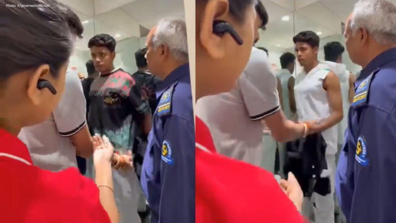
Srinagar Madrasa Fire 200 Students Rescued
Massive blaze in Hyderpora madrasa triggers panic; 200 students evacuated safely as firefighters bat
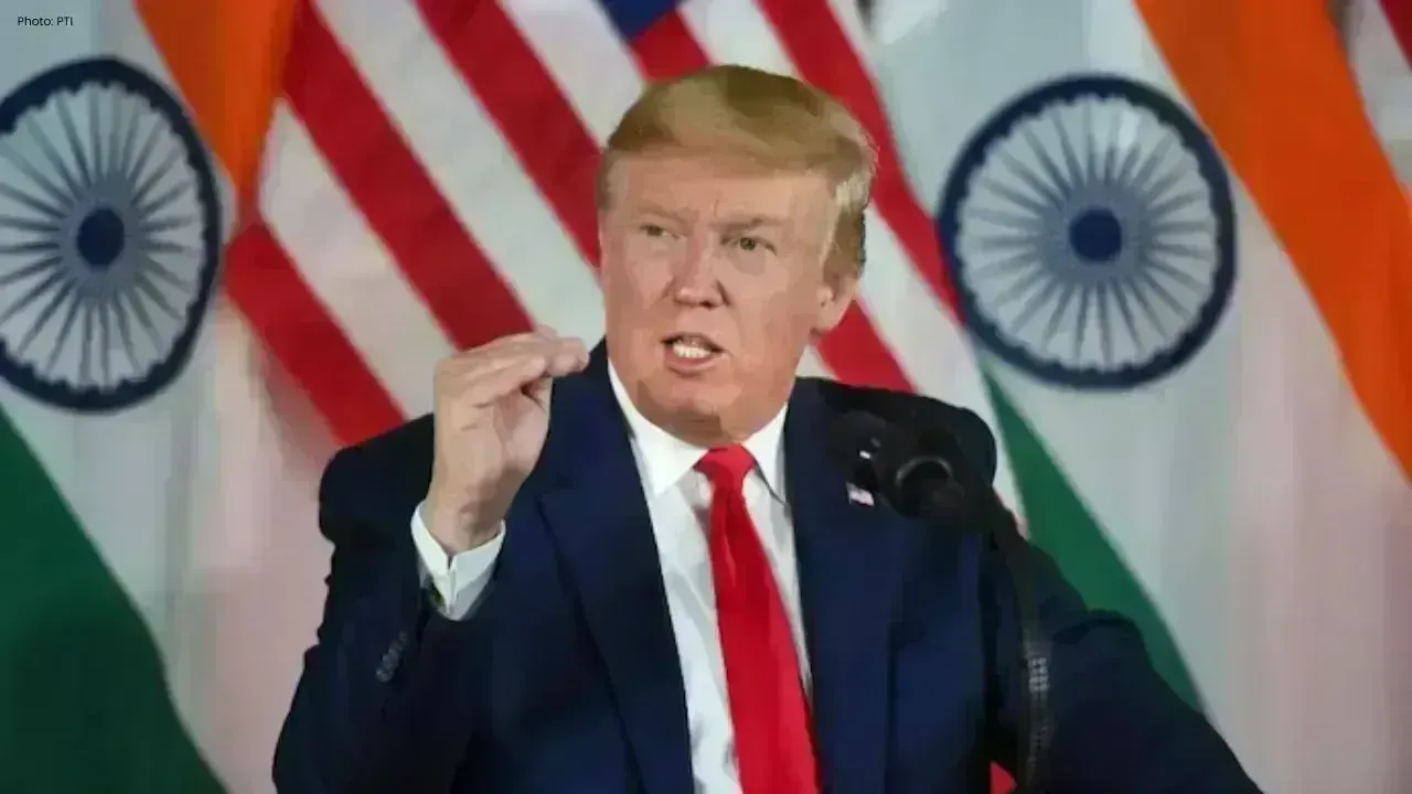
Trump Warns Iran Deal Now or Face Strikes
Trump signals military action if Iran talks fail, as US warships prepare and high-stakes negotiation
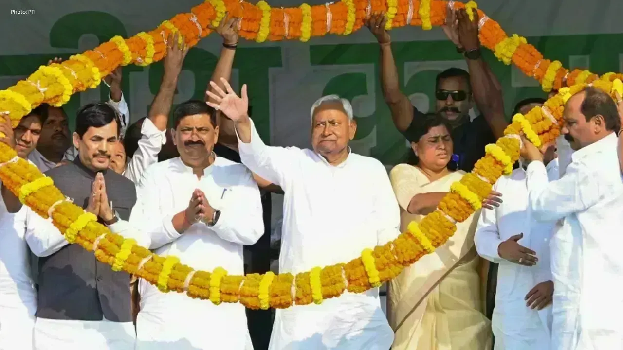
Nitish Kumar Set to Resign as Bihar CM Soon
Nitish Kumar likely to step down on April 13 after Rajya Sabha oath, with BJP expected to lead Bihar

Kim Jong Un Backs China’s Multipolar Vision
North Korea supports China’s global vision, strengthening ties during Wang Yi visit amid rising geop
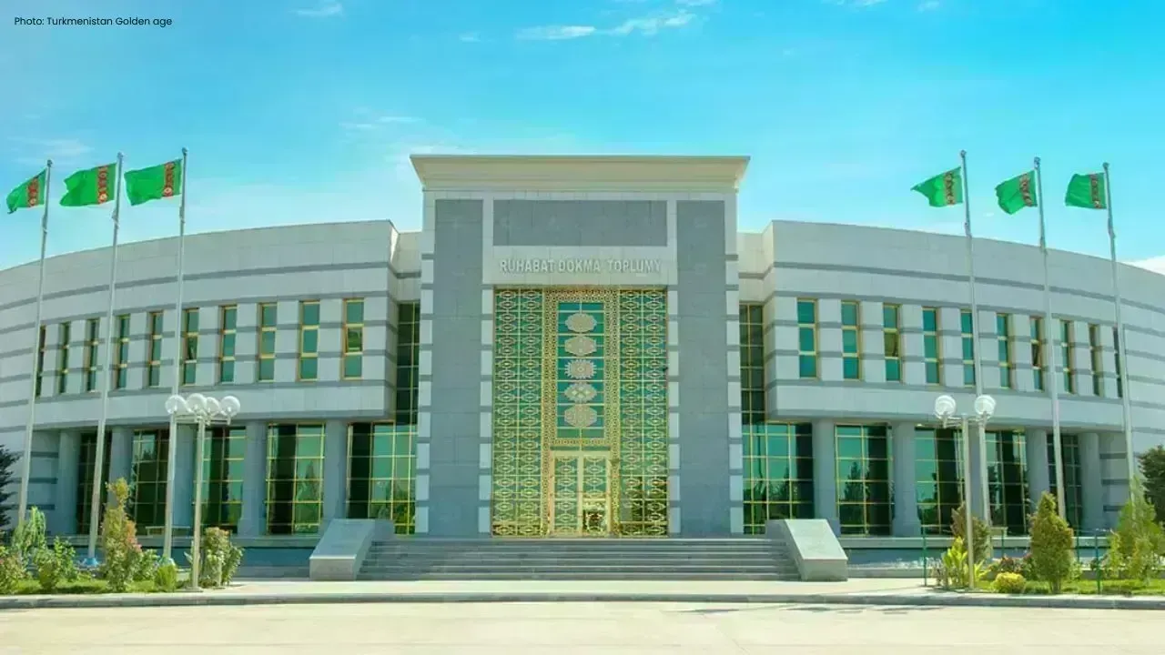
Ruhabat Fabrics Expand at Altyn Asyr Center
Wide range of Turkmen textiles showcased at Altyn Asyr, highlighting innovation, exports, and growth
Turkmenistan, UNESCO Discuss Cooperation Plans
Turkmenistan and UNESCO review cooperation, focusing on cultural dialogue, joint projects, and stren